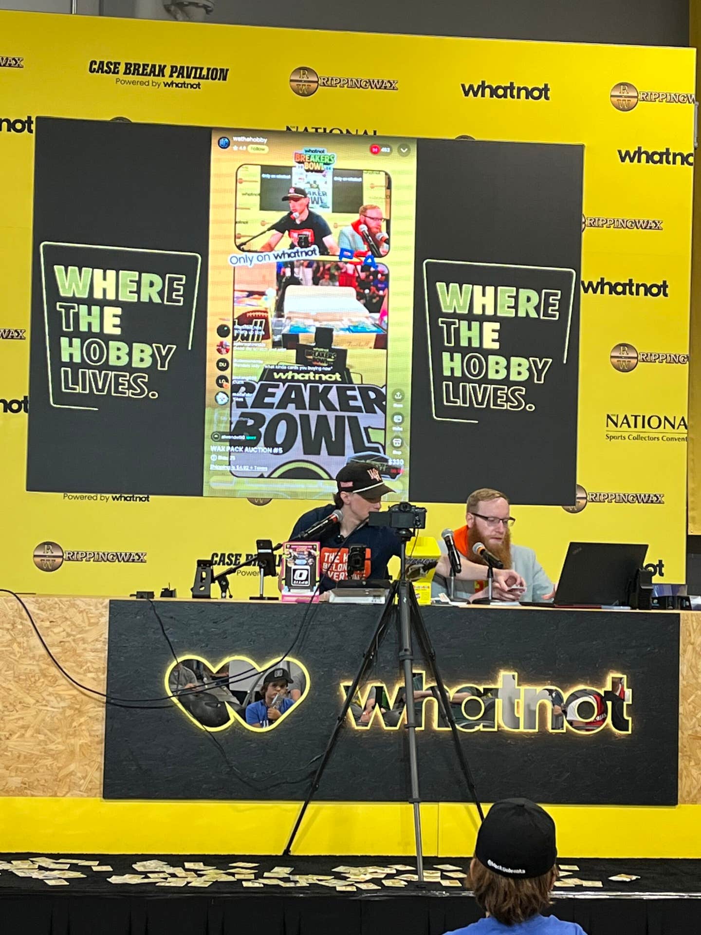
News
Card Variations Do Collectors Care
By George Vrechek
You’ve probably seen the ads or listings for “Rare and Scarce Unlisted Variations $19.99 etc.” While this may have caught your attention a few years ago, it has become like the letter from Nigeria offering unclaimed money. Your eyes glaze over and you go on to something else. Is this phenomenon the case of too much of a once-good thing or is it attributable to sellers looking to spark some interest when little is merited?
Variations in the Hobby History
Have variations always been of interest? Hobby publications reported the existence of “corrected and uncorrected” errors at least by the 1950s. The mix-up of the Johnson and Bolling boys in the 1955 Bowman set was documented shortly after the cards were issued. Because both the corrected and uncorrected versions were easy enough to find, no particular premium was associated with either card. Hobby publications like The Trader Speaks, The Sport Hobbyist and Sports Collectors Digest would have periodic columns dealing with errors and variations. There always seemed to be more interest in front variations than back. Hobby veterans Buck Barker, Irv Lerner and Bob Solon were among those eagle-eyed writers bringing such finds to the attention of collectors. Dick Gilkeson and Ralph Nozaki took the effort much further putting together compilations of the known variations.
New Variations Still Turning Up
You would think that with all the collectors having 40-60 years to look at their cards that we would be pretty well finished finding variations on old cards. Why then do we have SCD’s Bob Lemke reporting new variations with “loops in the sky” on the 1954 Carl Erskine and Preacher Roe Bowmans and a 1953 Bowman Black and White No. 43 Bevan birthdate variation? Why has it taken 50-plus years to find these?
Only the largest dealers have significant multiples of older cards from which to inspect for differences. However dealers have learned to not fall in love with the cardboard and don’t always spend time studying minutiae on their cards. They are more interested in making sure the cards find new homes with buyers and that the cards don’t “walk” out of a store or show. They aren’t likely to haul 20 or 30 copies of the same card to a show, even if they had that many. Individual collectors may have a few vintage duplicates but seldom significant multiples of a card. My theory is that with the Internet and eBay, we now have at least the fronts of many copies of the same card appearing for inspection by the world of collectors – including the variation advocates specifically looking for such glitches. What was tucked away is now in the open. Also what was considered a flaw too minor to discuss in the past has now at least been put on the table for consideration. When the big nuggets of gold disappeared shortly after the California Gold Rush, they started looking for even the smallest spec of glitter.
Variation or Printing Difference?
SCD’s Bob Lemke described the distinctions among errors, printing differences and variations in a column a few years ago. Errors are plentiful in every set but are of much interest only if they have been corrected in a later print run. The distinction between variations and printing differences can be a bit more complicated. If a card is changed in the print set-up so that cards are printed using an altered negative or plate, you have a true “variation.” For example, the 1954 Bowman No. 66 Williams and Piersall are variations, as are the Bolling and Johnson boys, and the copyright/no copyright 1950 Bowmans. In 1952 Topps double-printed Mickey Mantle, Jackie Robinson and Bobby Thomson on the same high-numbered sheets. Among other small differences, the stitches on the ball containing the number on the back of the double-printed cards either point to the right or to the left. The two (slightly) different cards of each player are considered variations even though the print set-up was never altered.
The printing process is never 100 percent consistent and a host of small things can cause differences in cards produced from the same plate. Usually ink sources add one color at a time, starting with black, cyan (blue), magenta (red) and yellow. If any of these get goofed up the result can be streaks, lines, one or more faint colors or out of register printing. You’ve got ink, plates, rollers, blankets, paper and people all possibly adversely affecting the finished product. If every such “printing difference” were collected, a master set might have endless “varieties” of printing differences. It is probably more amazing to find any two cards that are truly identical as opposed to finding two cards that differ.
1963 Topps Football Skies
Sometimes the distinction between a variation and a printing difference can take some investigation. About a dozen years ago, collector (and puzzle maker) Richard Ballhagen noticed that his 1963 Topps Football cards seemed to come with either a blue sky or a purple sky. One might think that the differences were caused by too much of one color and less of another during the printing and therefore a “printing difference.” However Richard noticed that while the skies looked different on the cards, the players’ faces looked about the same. He went to the trouble of magnifying the cards 60 times to see the colored dots produced in the printing process. He found that the magenta (red) dots had been masked off from just the sky so that only the color of the sky (and trees) changed (from purple to blue) and not the player or the foreground. This alteration must have taken place in the pre-press set-up and not during the printing itself. Therefore, the blue sky and purple sky cards are variations and not printing differences. With Richard’s detective work I concur that most, but not all, of the cards in the set come with either the purple or blue sky variations. Richard’s work can be found online at: http://members.socket.net/~rbpuzzles/
Ball or No Ball, Variation or
Printing Difference
At a recent card show a dealer displayed an “unlisted variation.” The card is No. 303 in the 1970 Topps Baseball set. The cartoon on the card’s back shows a ball leaving the pitcher’s hand. In one version of the card, the ball is clear; another has the ball removed. Someone may have thought the ball was an unintentional blob and removed it from the print master? This would make the two cards variations. I walked a few feet to Bill Henderson’s table, the “King of the Commons,” and found another version of the card showing the ball mostly gone as if it had been fading away. You might think that this is a printing difference with the ink not getting applied to that portion of the card. However, it seems unlikely that the black ink would just miss the spot where the ball was. It might be that someone removed the ball in the pre-press set-up, but that whatever they did to remove the ball partially came off during the print run. Two of the cards may be variations and the third a printing difference on one of the variations. Isn’t that simple? Regardless of whether the cards are variations or printing differences, it is surprising to find something new on 40 year-old cardboard.
Silly Glitches and Silly Prices
While cards of interest come to my attention, I also see cards advertised with differences that merit as much attention as the letters from Nigeria. Some eBay sellers have done a great job finding variations and printing differences; others have tried to capitalize on every blotch, blob or line with listings of rare and scarce unlisted variations. Someone recently listed a 1957 Topps with a name on the back that was a bit blotched up. Pretty silly to think the card was worth any premium. I had a good mind to write the seller to point out the error of his printing difference ways.
But hold on a minute! If I look in the SCD Standard Catalog of Baseball Cards under 1957 Topps, I find that the most expensive player card in the set is that of Gene Baker, the Cub second sacker. The back of Baker’s card lists him as “EUGENE W. BAKER” or “EUGENF W. BAKEP.” The Bakep card is listed at a value 54 times higher than the Baker card. Isn’t this also a silly printing difference and not a variation? It doesn’t seem likely that Topps misspelled his name and corrected it as opposed to it being a disappearing ink problem. What about the $4,000 No. 433 Pancho Herrer(a) in the 1958 set? The last letter of Herrera has been found with the “a” missing, or almost gone in various stages of disappearing ink. It sure smells the same as Baker/Bakep to me and not much different than the guy on eBay with the blotched up 1957 Topps card.
Do We Care?
Now you could argue that Topps didn’t suddenly run out of black ink when they got to the end of Pancho Herrera’s name. The plate must have been damaged in some way to lose part of the “a.”
A printer intervened and fixed the plate before reprinting; therefore it would be a variation. However if the “a” was fine and then got damaged during the printing with no human intervention, it sounds more like a printing difference. I don’t think anyone will ever know – or really care.
What people seem to care about is the end result. If the end result is dramatically different, not isolated, and in a popular set, there is interest regardless of how it happened. Where there is interest there is money. The message seems to be that if a card sells at a premium for whatever unusual reason, including the persuasiveness of the seller, that it is forever categorized as a special card. The earlier in hobby history the card is found, the higher the premium. I seem to recall the crafty Dutch being able to sell tulip bulbs for big bucks around 1637.
Update on Findings
With the above observations and complaints out of the way, I can share some of the more significant differences in post-war, older cards that have come to my attention since I last reported on the subject a few years ago. You will be the ultimate judge as to whether any of these cards should be valued at a premium. Also keep in mind that a variation collector’s idea of what is a “significant difference” would be of remote interest to those in the outside world including our spouses or relatives. My own hope is that none of these cards will sell for a premium, but that we can keep track of them to continue the never-ending quest to continue working on our collections without spending “silly” amounts of money. We can call the cards variations, printing differences, meaningless globs, or whatever we like.
1948 Bowman No. 5: Bob Feller is found with or without a strange looking white box behind him at the top of the grandstand.
1952 Topps No. 307: Frank Campos is found with two red stars on the back or with one red and one black star (printed over the red). We now know the front of the “two-red star” card also comes with the upper left border line either complete or missing.
1953 Topps No. 247: Mike Sandlock’s front has all of the sky in the background or is missing some blue sky at the left edge of the card.
1956 Topps No. 108: Laurin Pepper is either stepping on grass (white and gray card backs), or some type of yellow “spill” in the grass (whiteback), or the yellow blotch has moved near his left ear (grayback).
1956 Topps No. 323: Willard Schmidt either has all his stats on the back, some stats are blotched out, or some are a little less blotched out.
1958 Topps No. 59: Dave Sisler comes with a border to the right of the team logo that is either yellow, green, blue or somewhere in between.
1959 Topps No. 407: Moe Drabowsky’s front has a background with or without a small, white notch at the top.
1960 Topps No. 265: Rip Repulski’s name is either complete or missing the bottom part of the “K” on the front. If Herrera is worth $4,000, Repulski has to be worth $5,000. He had a longer career and a higher slugging percentage.
1960 Topps No. 293: Pitcher and basketballer Gene Conley has a left border that is even or has part of his glove faintly extending into the border. The glove color is too light to show up in a scan.
1973 No. 124: Jim Hardin either has a very green “leaf” in the grass behind him or no leaf. The “leaf” has a few versions as well. Several 1973 cards are found with or without breaks in the black border surrounding the front including Nos. 31, 417, 434, 473, 478, 504, 513, and 526. Jose Cardenal on card No. 393 has a red blotch on his hat or not.
1978 Topps No. 717: Nelson Briles has either a blue blob or glob on his chest or it has been whited out, or has been partially whited out twice, maybe four or more different globs. If the Bakep blob/glob is worth $400, the Briles globs have to be four times as scarce and valuable?
1978 Topps No. 725: Kurt Bevacqua is either cleaned up or has a glob on his shoulder but it isn’t the same glob that globbed onto Briles.
I’m working on investigating another group of new variations from an old set and will report on those next time around. Don’t be shy; let SCD or me know about any interesting globs, blobs, lines, loops, colors or lack thereof that you’ve found.