News
Classic Card Sets: 1956 Topps Baseball
By T.S. O’Connell
It almost seems a little spooky talking about Topps being all alone again, naturally or otherwise. In 1956, that’s how the Brooklyn-based card maker found itself after swallowing up archrival Bowman after a five-year battle over player contracts that ended up with only Topps left standing.
Fast forward to 2009, a mere 53 years later, and Topps is once again alone in the baseball card world after word that its modern rival, Upper Deck, got the sack from Major League Baseball in 2010.
The 21st-century version of Topps could do a lot worse than celebrate its new-found exclusive status by replicating the classic 1956 version, an iconic, nearly flawless card set that was as close to a perfect issue as any ever created. Even with a missing Hall of Famer and a couple of suits as cards No. 1 and No. 2.
There is a highly coveted advertising display piece from that year that touts the set as “The Biggest Series, the Biggest Cards and the Biggest Stars.” Which just goes to show you that hyperbole wasn’t invented in the post-Ike decades, but had a pretty good foothold even back then.
It wasn’t the biggest Series, though it was considerably larger than what Topps had produced a year earlier when the Bowman haggling had reduced Topps to just 206 cards. It couldn’t really claim the biggest cards, since the 1956 version was exactly the same dimensions as the previous four Topps issues, and it was to be the last year of that as Topps would try 21/2-by-31/2 inches in 1957, establishing a standard size baseball card that would last for the next 53 years and counting.
But there could be a case made that the issue had the “Biggest Stars.” After having enough MIAs in 1955 to send Chuck Norris out looking for them, the 1956 set wound up with a record 34 Hall of Famers in it, a mark not likely to be broken for some time, even though there are twice as many teams taking the field as there were in 1956. Baseball card issues over the last 30 years or so have been judged largely by what rookie cards are present; the 1956 issue comes up short there, too, with Luis Aparicio essentially the headliner.
And despite the nearly three dozen HOFers who did show up in 1956, there was even one very important one missing: Stan Musial.
But Stan’s absence (he also was a no-show in Topps issues from 1951-57) was just about the only criticism of the elegant offering in 1956, unless you want to grouse about having the terrifying William Harridge or his cohort Warren Giles as the first two cards, bumping Ted Williams all the way down to No. 5.
It could be argued that 1956 was the most effective horizontal baseball card set ever created, since its immediate predecessor, 1955, had so many cards missing it gets nudged by default, and the next time they tried it that way, in 1960, it didn’t work quite as effectively. That was because the bottom graphic panel so severely narrowed the main window for the player’s image that the guys often looked as if they were ducking down to get their mugs into the frame.
A celebration of really good grass
And the other thing making the 1956 set so spectacular was all the grass. Not before or since has a baseball card ever paid such homage to its most elemental ingredient, good ole All-American grass. This was the last card set where the pasteups were primarily the hand-colorized black-and-white photos that had been a staple since 1952. The next year Topps would turn largely to color negatives, making 1956 a last glimpse of a genre that would never look quite the same again.
And oh what treasures were created. The use of the colorized images meant that Topps designers would use some of the most iconic photos of many of the biggest stars in the game, a bit of early recycling that might have annoyed youngsters at the time but served the vintage-card collector just fine so many decades later.
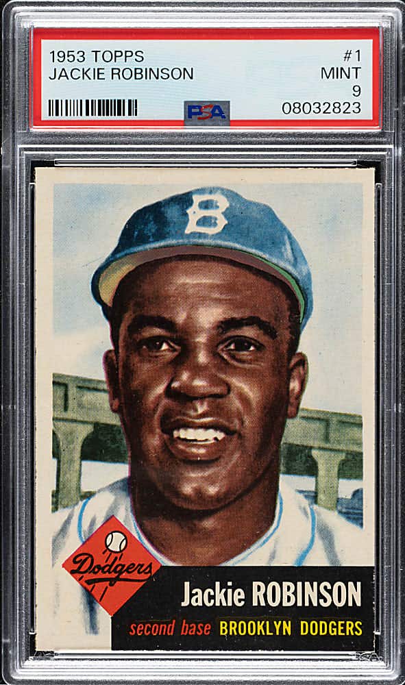
Under that regimen, the portrait images of Ted Williams, Henry Aaron, Willie Mays, Jackie Robinson, Ernie Banks, Al Kaline and a number of others were exactly the same from 1954-56. That would really be a nightmare if the images were lame and uninspiring, but in virtually all instances cited above, the portraits are little short of sensational.
Remember, with most youngsters seeing big-league baseball only rarely and then on grainy, black-and-white TV, the full-color baseball cards were unrivaled treasures in bringing their heroes to life.
And the action shots in the background, almost all the colorized black-and-white photos again, were tremendously compelling, in part from the eclectic assortment of shots but also from the freshness of showing the players in their natural habitat.
For those who like oddities, the 1956 baseball issue focuses on baserunning to a degree never attempted before or since. Almost 40 percent of the backgrounds for the 320 or so players pictured (remember, 16 team cards and two, ugh, executives) show various points in the baserunning experience.
That would seem unusual, coming as it did at a time when stealing bases was held in about the same level of regard as taking a Commie to lunch, which is to say not much. The ballparks were small, cozy and aging faster than you could say, “Go west, Walter and Horace.” Players could lead their league with a couple of dozen steals, and it was hardly uncommon to have just one guy per league end up with more than 20 in a season.
So with that backdrop, it’s cool to see baserunning so elevated and celebrated in those cards, with fielding coming in a solid second and the often posed-action pitcher follow-through a strong third. For a MLB landscape that so dramatically relied on the home run, you couldn’t tell it from the choices made by the Topps designers, who seemingly were channelling John McGraw as they pasted up their masterpieces.
Speaking of pasting up, this article features a cool photograph of an uncut sheet from 1956 from the first series, which shows 110 cards, including one single row of 10 double prints. In a series that included the likes of Williams, Warren Spahn, Jackie Robinson, Roberto Clemente and Al Kaline, my guy, Henry Aaron, winds up being double printed, as was National League President Warren Giles. You could postulate that the Topps guys batted .500 on that one.
There were two extremely significant innovations in 1956 as well. For the first time ever, the company created checklists that were unnumbered but included in the packs so that the eager youth of America could keep track of who they had and who they were missing.
That must sound fairly pedestrian to modern collectors, but it hadn’t always been the case and the lack of information about who was (or wasn’t) in the various sets had created a good deal of confusion from time to time.
So the checklists were a help, but despite that intrinsic utility, the little buggers didn’t garner a lot of respect from the youngster and were frequently thrown away. Mix in with that the tendency to keep them on the top or bottom of the stack and thus susceptible to rubber band abuse, or that most got rudely marked up in pen or pencil, and you can understand why finding high-grade specimens a half-century later can be a problem. As noted earlier, they are unnumbered, so technically the set is complete without them.
The other principal innovation was the inclusion of team cards. Topps threw in a nuance that would come to delight advanced collectors many years hence: they created variations of a half dozen of them, in this case three of each, making a bonanza for collectors years later who were fussy enough to pursue all available versions. For those keeping score at home, the six teams have cards either dated 1955, with the team name centered or team name to the left. I don’t think we noticed in 1955, or at least I didn’t.
If you’re really dedicated and into finding additional ways to pump up the number well past the conventional 340, card Nos. 1-180 are printed in either white or gray card stock. Though you won’t typically find specific listings in hobby reference tomes, some hobbyists contend that a premium is warranted for gray backs from Nos. 1-100, and for white backs from 101-180.
I don’t know how many collectors would wear out a lot of shoe leather chasing the white or gray backs, but just finding nice glossy specimens can be enough of a challenge. Though I’ve never seen it enumerated thusly, I still think the card stock from 1956 wasn’t quite as good as the previous year, making loss of gloss and color brilliance something you have to wrestle with in many instances, along with the usual scourge of centering woes.
I think that softer stock also shows up in many of the instances where the 1956 cards display the rough cut that you can often find with early Topps cards and more prominently from many of the mid-1960s O-Pee-Chee issues.
Figuring out how to reconcile with the “rough cut” has been something of a hobby dilemma for many years, with some experts assessing it harshly, but I think the onset of the third-party grading phenomenon over the past 15 years has helped add some needed perspective.
A pretty good case can be made that a card that shows the rough cut can be regarded – assuming the cut isn’t disconcerting in its profile and impact on the card’s overall appearance – as an indication that the card has received little or no handling down through the years. The tiny shreds of thin paper that are part and parcel of rough-cut cards simply wouldn’t survive even the most casual handling from collectors.
Of the 340 cards in the set, Nos. 181-340 are thought to be slightly tougher than the first 180, but the price differential is not enormous, certainly not to the degree that you would find just a few years later with the high numbers that would be a staple of Topps issues until 15 years later when the company changed to printing entire sets all at one time.
If you want a personal recommendation, here it is. A little more than 20 years ago, I put a 1956 set together card by card, and had about as much fun doing it as I’ve ever had in the hobby. I bought most of them mail order, and the rest at the famous Philly shows in the 1980s, and I’ve never had more fun than waiting for the mail every day to find out what Kit Young, Bill Goodwin, Barnett’s or Larry Fritsch had sent my way that particular day.
And if you need one more recommendation for putting one together, where else can you purchase that much grass without having to look over your shoulder all the time.
Not that I’ve ever done that.