Features
Card Set Review: 2014 Donruss by Panini
By John McMurray
At a time when modern baseball card styles often do not stand out, the 2014 Donruss set, manufactured by Panini, offers something different – a new look marked by a fidelity to old designs. The result is a base card style which offers some inspiration for how baseball card fronts might be designed going forward.
This year’s base Donruss card includes the team name written in a cursive style, reminiscent of the 1978 Topps baseball set, combined with mid-level side borders which are similar to those in the 1987 Donruss set. The card backs, albeit with a different typeface, strongly resemble those of the 1988 Donruss cards. The familiar Donruss logo is at the top left of each card.
Of course, simply merging aspects of previous card styles to form a new look is not necessarily enough to create a successful design. Blending the 1983 Topps and 1989 Donruss front designs would not work well, for instance, while some kind of hybrid of the pennant on the 1980 Topps cards combined with the solid white borders of 1973 Topps just might. In the case of the 2014 Donruss set, the design works.
Where Panini succeeds this year is in thoughtfully including elements with roots in different well-remembered card sets and then blending them to create a new look. The cursive style on the 2014 Donruss fronts is slimmer and more vertical than that in the 1978 Topps set, while the borders on this year’s Donruss cards are wider than in ’87 and include various team colors rather than being uniformly gray. Overall – and quite positively – the 2014 Donruss cards stand out because they look so different from other contemporary regular-issue cards.
In its 2014 Donruss design, Panini succeeds at being creative while not being excessively showy. There are benefits to using color selectively and in not overdoing any aspects of the front design. Panini successfully balances the two.
Just as notably, the cards are glossy without losing the feel of baseball cards from 30 years ago. Even though it is less colorful than Donruss cards of the past, this year’s design could easily have fit into the sequence of well-remembered Donruss sets issued in the mid-to-late 1980s.
Ideally, Panini would have used larger images along with a smaller border on each 2014 card. The company could also have increased the size of each player’s name, which seems to be disproportionately small. Noticeably, the colors of some of the side borders appear not to match the actual uniform colors that each team wears, as with the blue color on the Atlanta, Detroit and Seattle cards.
The most glaring problem with the 2014 Donruss baseball set stems from the fact that Panini does not have a license to use team names or logos. This restriction limits the appeal of the cards significantly: Team affiliations on the cards are mentioned by city only (e.g., “Detroit” on both front and back, rather than “Detroit Tigers”), and players are shown only in plain, airbrushed uniforms and hats. Dozens of players are pictured only from a side view, presumably to make the absence of logos less obvious. Poses are repeated frequently.
Even so, Panini’s creative attempt to bring forth an out-of-the-ordinary baseball card front design is worthy of attention. The 2014 Donruss set design evokes memories of vintage Donruss issues, and the cards feel like something from a different era. Given the set’s low price, the cards also fill a niche in an increasingly high-priced market.
Collectors surely will gravitate toward the 2014 Donruss subsets and inserts, which include perennial favorites, like Diamond Kings and Rated Rookies. Also included are Donruss Signatures cards and base card variations which highlight player accomplishments in gold foil. In addition, several retired stars – from Don Mattingly to Pete Rose – have cards in the set. But until Panini secures a license to include team names and logos, the Donruss base set, unfortunately, will be quite limited in its appeal.
There is certainly plenty of demand for producing cards of current players on reproductions of vintage designs, including the 2014 Topps Heritage cards where players appear on a 1965 Topps card style. Such cards have a strong following, and they seem to gain in popularity each year. Yet it is also important to push the envelope on new card designs without relying as extensively on employing ones from the past. The 2014 Donruss baseball cards represent a step in that direction.
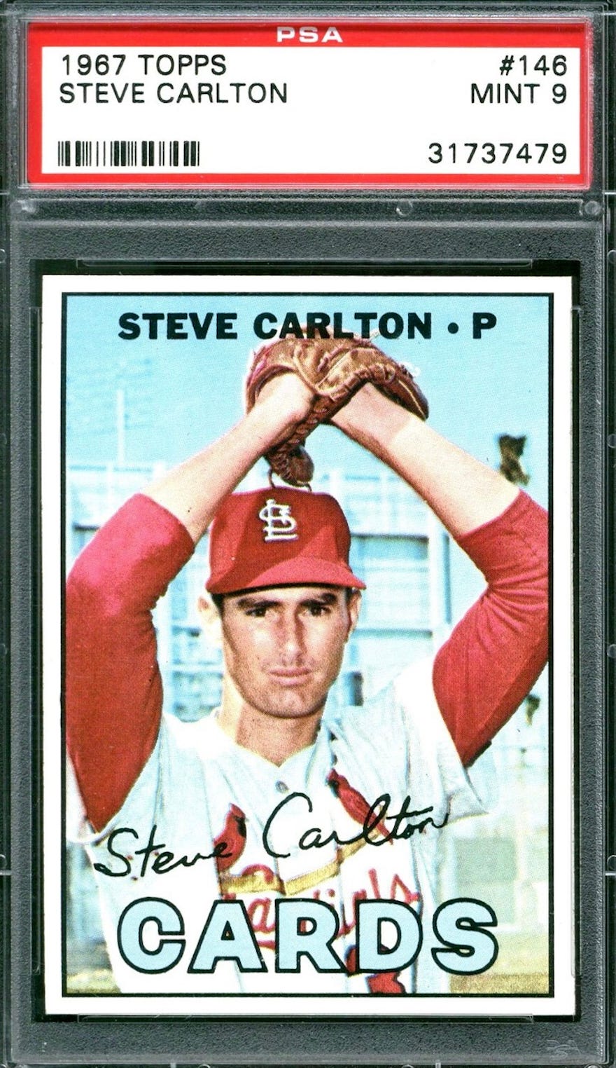
Many well-done baseball card designs include less rather than more. The 1967 Topps baseball cards, for one, include only the player’s name, position and facsimile signature along the respective team’s name, about as simple an approach as one could have. The main design feature on 1981 Topps baseball cards is a player cap, while 1989 Topps merely includes a small pennant with each player’s name. The new Donruss cards are in a similar mold.
With its many repeated poses, inconsistent photographic quality and lack of team names and player logos, the 2014 Donruss baseball card set cannot compete with other baseball card sets out this year. But Panini’s attempt to create a card design which links to the past while also providing a distinctive look bodes well for the future.
Combining variations of successful past designs while adding some innovations is an approach which card companies have not explored sufficiently in recent years. The 2014 Donruss set represents the best effort in recent years to offer a new card design that should appeal to collectors of any age.
John McMurray writes a monthly column for SCD. He can be reached at jmcmurray04@yahoo.com.


