Collecting 101
2007 Heritage is faithful homage to quirky 1958’s
The 2007 Topps Heritage issue boasts something that previous Heritage offerings have been hinting at, but this time it is precisely nailed: an almost obsequious linkage to the color coding and numbering of the original 1958 Topps set that was its inspiration.
If that sounds like a criticism, then it's a poorly constructed sentence. It's a wonderful preoccupation that the Heritage issue shows to honor that original. The 1958 set was notably - aside from being printed on a softer card stock that could make finding high-grade examples an iffy proposition - a color-dominated design, so the Topps Heritage homage naturally relies heavily on color, but that's hardly the only aspect the modern designers turned to in pushing the nostalgia buttons.
I used to think the 1966 Topps set could have been nicknamed "Men Without Hats," and in light of that description, the 2007 Heritage issue might be referred to as "Men with Oversized Hats Pulled Too Far Down." That clearly is not quite as catchy a name, but it's certainly a fair appellation. I could shuffle through a stack and pick out a couple of dozen, but where's the fun it that?
That's one of a number of areas where the Topps guys could be applauded for this one (and in previous Heritage efforts). I know that for many dealers and, no doubt, thousands of collectors, the scarcity question connected with short prints and yellow-letter variations (plus all the parallels) is the big draw, but I'd like to make the case that putting this set together could be fun even without all that stuff.
I suspect that you could sit for hours on end looking at this set, and I am not talking about the time spent putting the cards in numerical order and doing all the set-building good stuff. Nope, what I am talking about requires a good deal of time and attention, plus a lot of cross-referencing to the original 1958 set.
What about putting a set in plastic sheets alongside a real 1958 set? That strikes me as a nice fantasy, but one that I suspect would collide headlong with collectors' well-entrenched squeamishness about VG cards nestled alongside those in near-mint or better condition.
Obviously, not everybody has an original set, but there are also a couple of Topps books that show all the cards for those who don't have it. Again, I won't attempt here to do anything comprehensive, but I will take a leisurely stroll through 2007 Heritage and spot those things that jump right out. And as a disclaimer, I will also concede the possibility that I am seeing connections that aren't really there or might not have been intended by the designer. Doesn't matter. It's still fun.
For example:
Johan Santana, No. 255, last year's Cy Young winner on the same number card as 1958 Topps Bob Turley, who was the 1958 Cy Young winner. I also think the pose shows him ducking under his name atop the card, which I chose to interpret as a respectful nod to card No. 16 from 49 years ago, Charley Neal.
David DeJesus, No. 91, shows him wearing a glove that's a whole bunch older than even 1958. Nice touch.
I haven't seen all the cards in the set (there are short prints, after all, for those of you scoring at home), but I would hope there's at least one card with the bat kind of mysteriously cropped out from the follow-through as in the Gino Cimoli No. 286 in 1958.
I don't know if card No. 347, somebody named Boone Logan, is any kind of homage, but the expression on his face is more than a little spooky.
No. 30 Ichiro is clearly a salute to the Aaron card of the same number from 1958, which naturally I approve of, just because it's Aaron.
Card Nos. 14, 16 and 26 (Bobby Abreu, Wilson Betemit and Adrian Gonzalez, respectively) show some cool, campy follow-throughs, especially Gonzalez, which is nicely reminiscent of the goofy No. 329 Bob Cerv card in the original. I just like picking on Cerv; it's a long story.
Anyway, those three cards illustrate the effort that Topps clearly put into the photography end of it, getting modern players to assume seemingly awkward poses in pursuit of the perfect baseball card. The assumption is that it was a lot simpler 50 years ago, when there was a far greater emphasis on the "posed action" photography, plus the income chasm between the photographer and the ballplayer was infinitely smaller. Sort of like the difference between asking Gilligan to get you a Miller Lite or making a similar request of Mr. Howell.
Ultimately, though, I suspect the greatest lure of this Heritage issue is the diligent use of the background colors, making every glance at the "modern" card of a particular shade, like the orange with blue panel on the bottom that makes you think of the 1958 Mantle, or a current Tiger with the bright red making you remember Al Kaline's grand portrait back then. Catching all the links between both the numbering and the colors I think might be a never-ending challenge, but certainly a striking addition to the otherwise often static hobby of collecting baseball cards.
I know there must be a bunch of websites that have already done a lot of this legwork. I guess I would urge readers to let me know about these either by an e-mail or in the comments section of my now-four-week-old blog.
And here, just to show I can make an observation that falls somewhere short of gushing, I would note some disappointment in the Mickey Mantle Home Run Number cards. This is actually a broader criticism that I would offer to card manufacturers in general ... and as my old high school teacher would say, "You know who you are."
Anyway, how can it be artistically sound to take a nice image and then essentally reduce it to half the available size in order to include a massive graphic device that elecits a big ho hum, if that? It happens frequently, especially with cards of old-time players, and it almost always seems to me to end up swinging and missing.
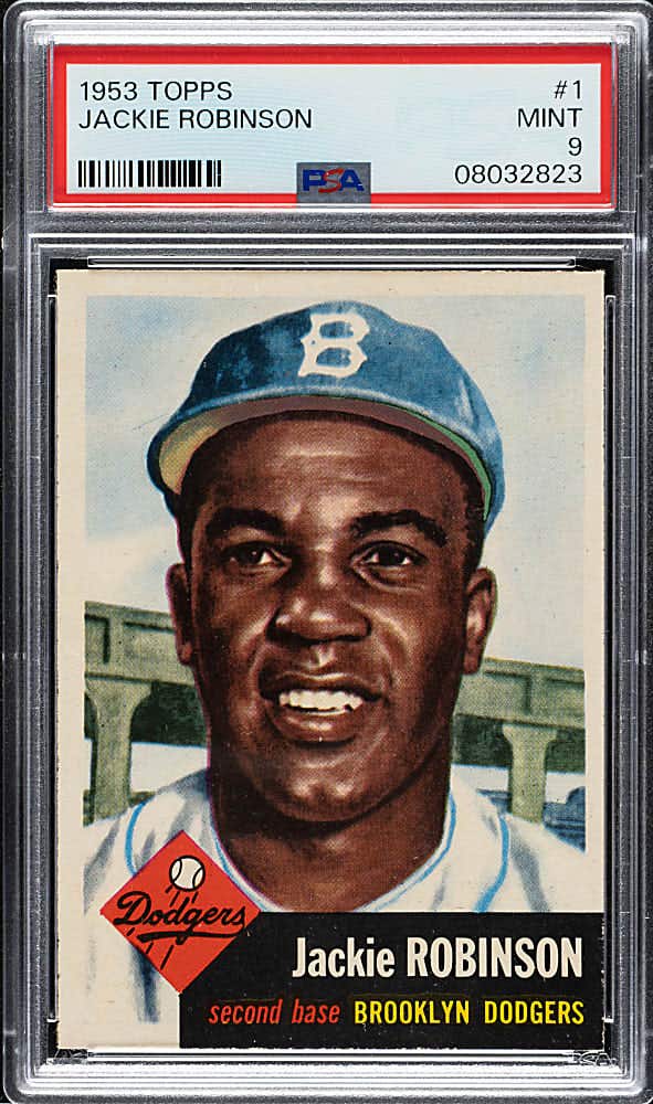
It's worth remembering that the editorial descriptions of many of the greatest sets in baseball card history (i.e. T206's, Turkey Reds, 1953 Bowman Color, 1957 Topps) frequently use the term "clean and uncluttered."