
News
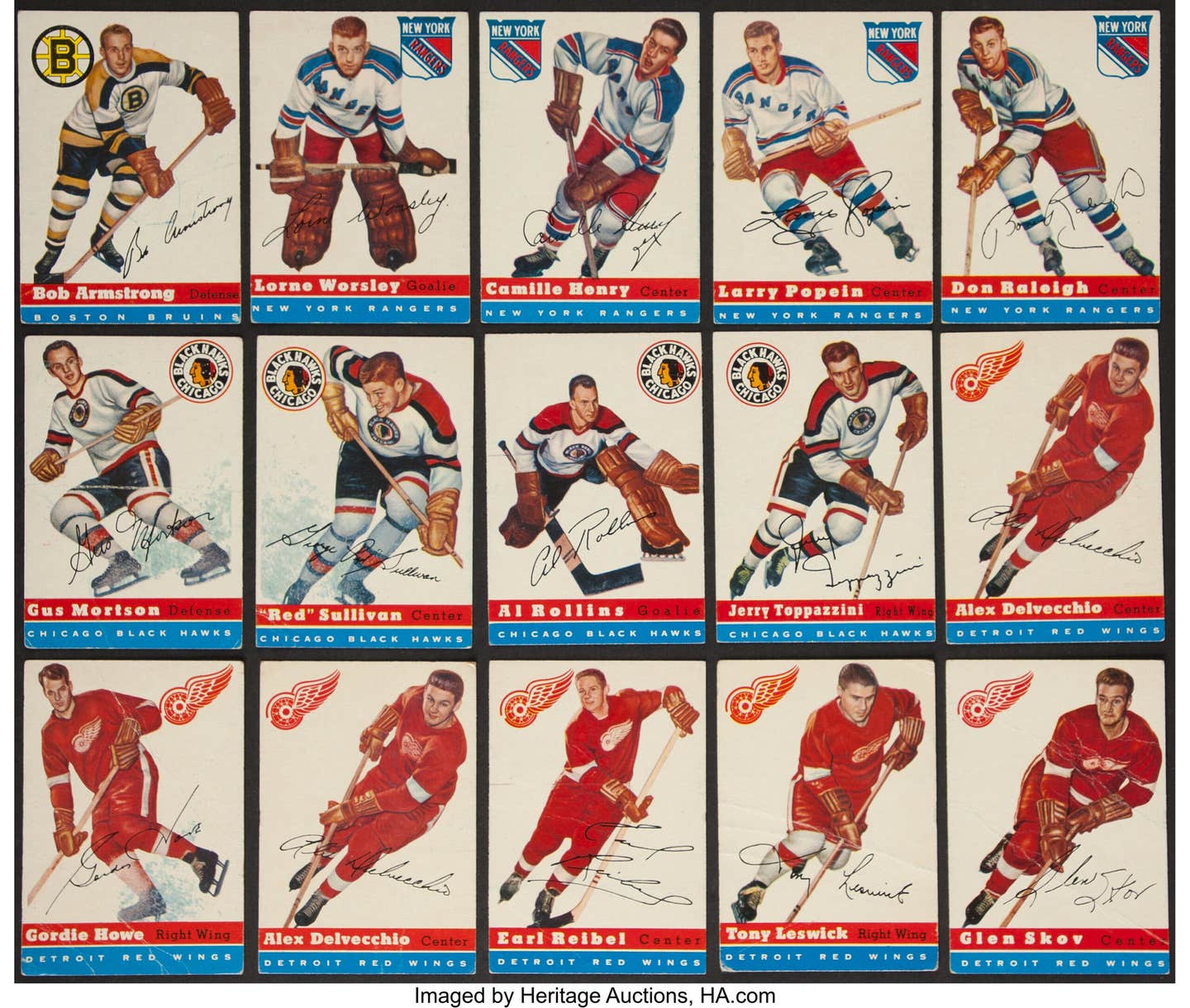
Classic Card Sets: 1965 Topps Baseball
By T.S. O’Connell
The United States jumped into three wars in 1965: one ended badly a decade later and the other two are still going nearly 45 years later, with the results still very much up in the air. While we’re still out there fighting the wars on poverty and smoking, our Vietnam intervention would prove to be a disastrous one for a whole generation of Americans. That was the kind of year it was.
For Topps, not so bad, however. It was 10 years into its own cease-fire with archrival Bowman, and the 1965 issue yielded one of the genuine anomalies of the era: a virtually mistake-free issue that required almost no plate changes and thus offered no variations, save for a Seventh Series checklist card with large or small print on the front. Whoopee ... and there’s no price differential between the two. As close as the set gets to creating some toughies would be the short-printed high numbers, which traditionally carry a nominal premium over the other high numbers, which were already relatively modest for a 1960s high series.
The other baseball-related disaster in 1965 would be the demise of a New York Yankee dynasty that had essentially lasted for 40 years with only minor timeouts for retooling. The vaunted Yankees ended their final string of five pennants in 1964, falling to sixth place, 25 games behind the Minnesota Twins. It could hardly have been imagined as the youth of America shuffled their colorful 1965 Topps cards, but the New Yorkers would not return to the World Series for a dozen years.
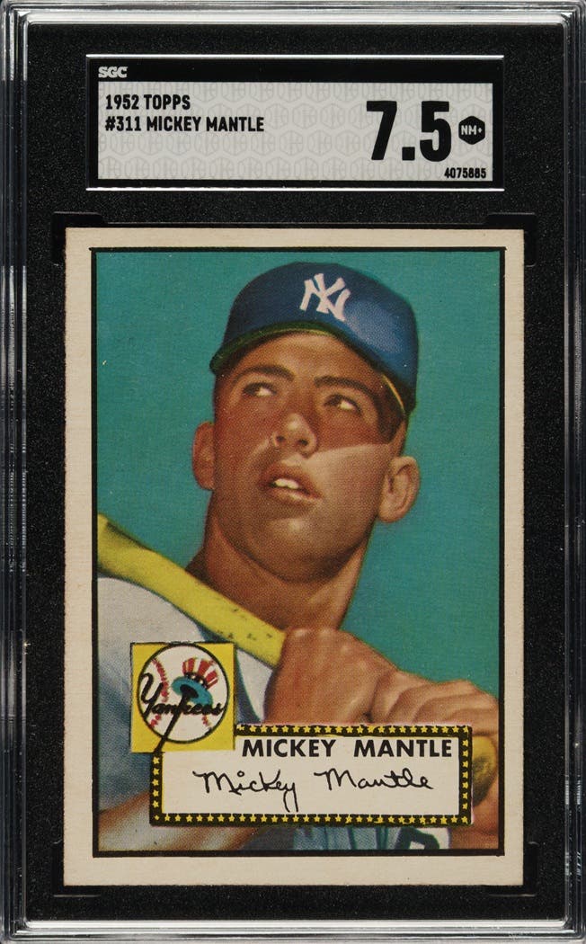
Nothing marked the decline of the franchise more starkly than the decline of its marquee name, Mickey Mantle, who battled age and nagging injuries while getting only 361 at-bats and managing just 19 homers. He would struggle on for three more decidedly unMantle-like seasons, and his ball club would ultimately land in the American League basement, to the horror of its legion of followers.
For its part, Topps did Mantle up proud in 1965, producing four great cards of the Yankee legend, cards that would be quite pricey decades later as the card-collecting hobby exploded. Card No. 350 of Mantle, the regular-issue card that year, is easily one of his toughest from the decade to find well centered and in high grade, and pricey when you do find it. Mantle also appears on two of the League Leader cards that lead off the issue and in a nifty World Series card chronicling his walk-off home run in Game 3 at Yankee Stadium.
As the cards shown here illustrate, the photography was as good as Topps would get in the 1960s, neatly balancing posed-action classics with nice portraits, with both styles cropped more closely than probably any other Topps offering of the period. Those tight framings were further enhanced by the near-perfect color coding combinations, with the team designation graphic element, the pennant in the lower right-hand corner contrasting elegant with the bright background colors.
It says here that well-constructed design meant 1965 ended up being the best issue of the decade in terms of presentation. One of the ways that kind of hyperbole can frequently be justified is by asking for how many players is this the best card he ever had in his career?
Obviously, that’s tremendously subjective, but conceding that minor irritant, the number comes out to literally dozens, including Hall of Famers Hank Aaron, Ernie Banks, Lou Brock, Bob Gibson, Al Kaline, Sandy Koufax, Juan Marichal, Eddie Mathews and Willie Mays, to name the biggies. The cards of All-Stars Felipe and Matty Alou, George Altman, Tim McCarver, Zoilo Versalles, Earl Battey and Tony Oliva are just as compelling, with the purple (background) and yellow (pennant) of the American League Champion Twins ranking right up there as the best in the set, along with the Giants, Cardinals, Tigers, Braves and Yankees.
Slap these babies into nine-pocket sheets and you’ve got as purty a Topps set as you’ll ever find. Get the Mantle taken care of early on and putting the whole set together is not all that daunting, because of two big reasons.
The rookie crop, while boasting a nice array of big names and even some good-looking pasteboards, just doesn’t have that many terribly expensive cards. There was a giddy time many years ago when the Steve Carlton rookie card used to be the most expensive card in the set, which is saying a lot for one of those multi-player cards that suffered from marginal utility and lame aesthetics. In the last 20 years, neither Carlton nor Mantle have added anything to their statistics, but the former’s star has dimmed dramatically, while the latter, well, you know, it’s Mickey Mantle.
There are other rookies, of course, but so many are on those icky multi-player cards, some with as many as four, that it strained the efficacy of the rookie phenomenon, at least from an attractiveness standpoint. Sharing your rookie card is always a bummer by definition, but sharing it with three other guys in tiny colorized black-and-white photos is little short of ignominy.
There are rookie cards of four Hall of Famers: Joe Morgan, Carlton, Catfish Hunter and Tony Perez. Catfish ought to win some kind of booby prize for having arguably the crappiest rookie card of any Hall of Famer ever, maybe of any player ever. At least Morgan only has to share space with one other ballplayer, and in this case a pretty good one at that, Sonny Jackson.
The two most attractive rookie cards in the set are of a couple of pretty fair American League hurlers: Luis Tiant and Denny McLain. They got their own great-looking single cards; Tiant ought to get more consideration for Cooperstown than he has thus far, and McLain once looked like a surefire immortal, but ultimately ended up swapping immortality for infamy. The two terms may occasionally be used interchangeably in this particular millennium, but nobody confused the two back in 1965.
So anyway, the rookie crop ends up being utterly affordable. And the other big break for set collectors is the high numbers. They are just as high (numerically) as other years, but the prices never ascended to the same levels as some of the other biggies like 1961 or 1967. About half of the high series (Nos. 507-598) are the short prints, but as noted earlier, they only get bumped a couple of bucks. Eminently collectible, even in these tough economic times.
“It’s a nice, popular set, with good availability in Near-Mint condition,” said no less of an authority than Alan “Mr. Mint” Rosen. “The Mantle card and the high numbers are tricky to find centered (frequently off-center to the right), and this is the hardest Mantle to find in top grades in the 1960s except for 1962,” the uber-dealer continued. “Nos. 523-598 are a little tougher, but the usual high-number difficulty,” he added, confirming the earlier view.
In the oddity department, the Topps guys must have been largely on their game in 1965. Hall of Fame wannabe Jim Kaat had his name misspelled on the front of his card – Katt – apparently from the designer getting carried away by the “Kitty” nickname, and the Lew Krausse card (No. 462) actually pictures Pete Lovrich, but that was about it from the proofreading end of it.
I suppose it’s conceivable that an astute proofer could have figured out that the Cardinals’ backup catcher, merry prankster Bob Uecker, was having a bit of fun by posing as a left-handed batter, but it’s probably more accurate to note that since he couldn’t hit his weight from either side of the plate, who cared?
So it’s a spectacular looking set, with a great design and colorful, vibrant presentation perhaps unmatched in the decade, tolerable pricing for high numbers and rookies and only a high-dollar Mantle card offering any discouragement to somebody looking for a vintage set to chase. What’s not to love?
The missing caps, damn it! That curse of 1960s Topps issues, where the graphics guys would opt for a handsome portrait sans headgear out of concern somebody might get traded or otherwise shifted from one team to another. Despite their apparent proclivity to doing it, it must be the Topps crew didn’t really like airbrushing logos off caps, so they often went to the no-cap choice as a way of avoiding that dilemma.
All the flat-tops and crewcuts could be charming, except that ballplayers just don’t look right without their caps on, or, alternately, with their caps on and the logos otherwise besmirched.
And a final oddity. The snappy pennants that show the various logos and the team nicknames had one exception: the Houston Colt .45s, had a new stadium in 1965 and what a stadium it was! The Astrodome was the newest wonder of the world, and the ball club was clearly embarking on finding a new nickname for the retreads, er, ballplayers who would be encamping there.
Topps knew a new designation was in the works, so they cleverly used “Houston” through some of the early series, and then plugged in “Astros” later on.
Good thing they weren’t fiddling with stadium names in those days the way we do in modern times. The Topps guys would have been beside themselves.